")
")
Color is far more than a mere aesthetic choice; it’s a potent tool that can significantly influence user perception, emotions, and behaviors. Understanding color psychology is crucial for designers and marketers alike as it enables them to craft a website that not only looks appealing but also aligns with the brand’s message and objectives. In this blog, we dive into the essence of color psychology in web design and guide you on how to choose the perfect color palette for your website.
The Power of Color Psychology
Color psychology studies how colors affect human behavior and decision-making. While individual experiences can influence how people perceive color, certain universal truths apply. For instance, blue often conveys trust and stability, making it a popular choice for financial institutions. On the other hand, red can evoke feelings of passion and urgency, which is why it’s frequently used in call-to-action buttons.
Understanding these psychological effects allows web designers to create an environment that enhances user experience and guides visitors toward desired actions, such as making a purchase or signing up for a newsletter.
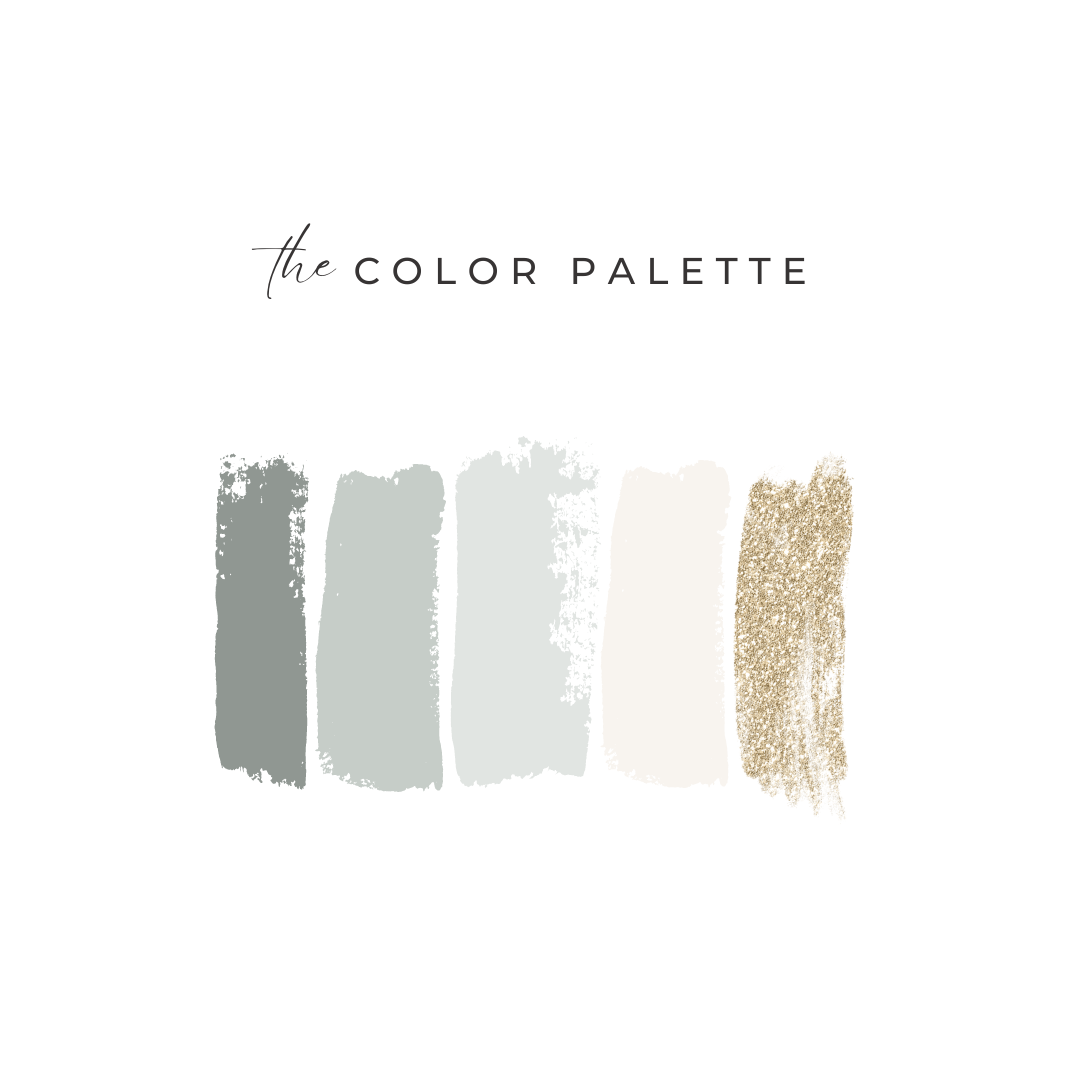
Building Your Color Palette
1. Understand Your Brand Identity
Your color palette should reflect your brand’s identity and core values. If your brand is all about innovation and energy, bright and bold colors like orange or yellow might be fitting. For a brand that prides itself on trust and professionalism, consider cooler tones like blue or green. Understanding what your brand stands for is the first step in choosing a color palette that resonates with your audience.
2. Consider Your Target Audience
Different demographics respond to colors differently. Age, gender, and cultural background can all influence color perception. Younger audiences might appreciate vibrant and lively colors, while a more mature demographic may prefer subdued and sophisticated shades. Research your target audience to understand their preferences and how they relate to colors.
3. Prioritize User Experience
User experience (UX) should be at the forefront of your design choices. Colors not only need to align with your brand and audience but also need to ensure readability and navigability. For example, contrasting colors can improve text readability, while harmonious colors can create a more comfortable browsing experience. Always test your color palette to ensure that it contributes positively to the overall UX.
4. Embrace Color Theory
Color theory is a fundamental guideline in design that explains how colors interact with each other and how they can be combined. Utilizing the color wheel, you can create a palette based on complementary, analogous, or triadic schemes, each offering different vibes and aesthetics. Leveraging color theory helps maintain balance and coherence throughout your design.
5. Leverage Emotional Triggers
Every color can trigger certain emotions and actions. For example, green is often associated with growth and health, making it ideal for wellness brands. Orange, being energetic and fun, can stimulate physical activity and is excellent for fitness or adventure-related websites. Choose colors that evoke the emotions and actions relevant to your brand’s goals.
6. Test and Iterate
Choosing your color palette is not a one-and-done process. It’s essential to test your choices with your target audience to see how they react. A/B testing different color schemes can provide valuable insights into what works best for engaging and converting your visitors.
The Hue of Success
The right color palette can transform your website from a mere digital space to a compelling brand experience. By understanding and applying the principles of color psychology, you can create a website that not only stands out but also resonates deeply with your visitors.
If you’re ready to dive deeper into the psychology of color and design a website that truly reflects your brand’s heart and soul, connect with us at The Agency. Let’s paint the digital world with the colors of your brand’s story.
Remember, in the palette of web design, every color is more than a visual element; it’s a voice that speaks volumes. Choose your colors wisely, and watch as they bring your digital narrative to life.


 and your core offerings like web design, branding, and SEO for service-based businesses: --- ### 🔹 **Left Image (Explore Our Services)** * **SEO-Focused Image Title:** Website Strategy Planning for Service-Based Businesses * **SEO-Focused Alt Text:** Woman reviewing website design plans and strategy for branding in a cozy workspace with coffee 📈 **Why it’s better:** Includes keywords like `website design`, `strategy`, `branding`, and `service-based businesses` — all highly relevant to your niche. --- ### 🔹 **Right Image (The Portfolio)** * **SEO-Focused Image Title:** Creative Branding and Web Design Workspace Setup * **SEO-Focused Alt Text:** Branding expert working on client projects at a modern glass desk with coffee, laptop, and sunglasses in a bright office 📈 **Why it’s better:** Integrates terms like `branding expert`, `web design`, and `client projects`, which help Google understand the context of your work and improve image visibility in search results. ---")

Comments +