")
")
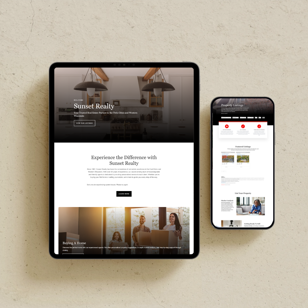
Your website is more than just a digital storefront. It’s a powerful tool that should guide visitors toward a specific action—whether that’s booking a call, making a purchase, or signing up for a service. The problem many businesses face is that they focus too much on aesthetics and not enough on strategy. A website that looks beautiful but doesn’t convert is failing at its primary purpose.
This is where the psychology of web design comes into play. Understanding how people interact with your site and what influences their decision-making process can transform your website into a high-converting machine. By using color psychology, user experience (UX) principles, visual hierarchy, and cognitive triggers, you can shape the way visitors navigate your site and encourage them to take action.
How First Impressions Shape Website Success
When someone lands on your website, they form an opinion within 0.05 seconds. This means that before they even read a word, they have already decided whether to stay or leave. First impressions are based on layout, colors, speed, and visual hierarchy. If your site feels cluttered, loads slowly, or lacks a clear structure, users will bounce without a second thought.
To capture attention immediately, your homepage should have a clean, modern design with a clear value proposition. Visitors should instantly understand what you offer and why it matters. A well-placed headline, subheadline, and strong call-to-action should be visible without scrolling. The layout should feel intuitive, guiding the visitor effortlessly through your content.
The Role of Color Psychology in Website Conversions
Colors evoke emotions, and the right color scheme can influence how visitors perceive your brand and interact with your site. Studies show that color improves brand recognition by 80% and has a direct impact on trust, engagement, and conversions.
Different colors trigger different psychological responses. Blue is often associated with trust and professionalism, which is why banks and corporate brands frequently use it. Red creates urgency and excitement, making it ideal for call-to-action buttons. Yellow conveys optimism and energy, while black gives a sense of luxury and sophistication.
For maximum conversions, your call-to-action buttons should contrast with the rest of your site so they stand out. A muted background with bold, attention-grabbing CTA buttons increases click-through rates. If your site blends everything into the same color palette, your CTA gets lost, making it less effective.
Visual Hierarchy: Guiding the User’s Eye Toward Action
Your website should follow a structured hierarchy that directs visitors exactly where you want them to go. The human eye naturally follows specific patterns when reading content, and a well-designed layout takes advantage of this behavior.
There are two primary scanning patterns users follow:
- The F-Pattern: Used for content-heavy pages, where visitors skim headlines and subheadings.
- The Z-Pattern: More common for landing pages, guiding users from one focal point to another in a zig-zag motion.
To ensure your key message gets noticed, place important elements like headlines, CTA buttons, and testimonials where users naturally focus. A well-organized site with clear sections and defined spacing reduces overwhelm and makes it easier for visitors to engage.
Cognitive Load: The Power of Simplicity in Web Design
Too much information at once overwhelms visitors and leads to decision fatigue. If users have to think too hard about what to do next, they will leave without taking any action. A clean, minimal design with clear navigation ensures an effortless user experience.
Simple, intuitive navigation with no more than 5-6 menu items prevents confusion. Every page should have a singular purpose, with content broken into digestible sections. Large blocks of text discourage reading, so use short paragraphs, bullet points, and visuals to keep users engaged.
Whitespace is another crucial factor. A cluttered site feels chaotic and untrustworthy, whereas a site with strategic spacing between elements looks polished and professional. Letting your content breathe improves readability and keeps visitors on your page longer.
The Science of Trust: Why Social Proof Boosts Conversions
People are influenced by the actions and opinions of others. This is why testimonials, case studies, and reviews play a massive role in website conversions. When potential customers see that others have had positive experiences with your business, they are more likely to take action themselves.
Adding real client testimonials with names, photos, and specific results builds trust instantly. Case studies that highlight before-and-after transformations show potential clients exactly what they can expect. Trust badges, media mentions, and certifications further establish credibility.
Another key element of trust-building is transparency. Clearly display your contact information, business credentials, and a professional bio to humanize your brand. If visitors feel uncertain about who is behind the business, they are less likely to convert.
The Fear of Missing Out (FOMO) and Urgency Tactics
People are wired to respond to scarcity and urgency. When visitors feel like they might miss out on something valuable, they are more likely to take immediate action. This is why limited-time offers, countdown timers, and exclusive deals work so well.
Phrases like “Only 3 Spots Left”, “Offer Ends Soon”, and “Join Before Prices Increase” create a sense of urgency. Countdown timers for promotions or sign-ups add a psychological push that encourages visitors to act quickly instead of procrastinating.
When using urgency tactics, it’s crucial to remain authentic. False scarcity can damage trust, but genuine limited-time opportunities drive action without feeling manipulative.
Turn Your Website into a Conversion Machine
Understanding the psychology behind web design allows you to influence visitor behavior, create trust, and drive higher conversions. A high-performing website isn’t just about aesthetics—it’s about strategic placement, compelling messaging, and seamless user experience.
If your website isn’t converting the way it should, it’s time to optimize its design, structure, and messaging. At The Agency, we specialize in strategic web design that blends psychology, branding, and conversion tactics to deliver measurable results.
Right now, we’re offering 20% off web design packages when you mention Code Elevate20. Don’t let your website underperform—let’s create a high-converting digital experience that drives real business growth.
📩 info@marketingwiththeagency.com
📞 (605) 610-9380
🌐 marketingwiththeagency.com
Let’s build a website that not only looks stunning but works as your most powerful marketing tool.


 and your core offerings like web design, branding, and SEO for service-based businesses: --- ### 🔹 **Left Image (Explore Our Services)** * **SEO-Focused Image Title:** Website Strategy Planning for Service-Based Businesses * **SEO-Focused Alt Text:** Woman reviewing website design plans and strategy for branding in a cozy workspace with coffee 📈 **Why it’s better:** Includes keywords like `website design`, `strategy`, `branding`, and `service-based businesses` — all highly relevant to your niche. --- ### 🔹 **Right Image (The Portfolio)** * **SEO-Focused Image Title:** Creative Branding and Web Design Workspace Setup * **SEO-Focused Alt Text:** Branding expert working on client projects at a modern glass desk with coffee, laptop, and sunglasses in a bright office 📈 **Why it’s better:** Integrates terms like `branding expert`, `web design`, and `client projects`, which help Google understand the context of your work and improve image visibility in search results. ---")

Comments +