")

")
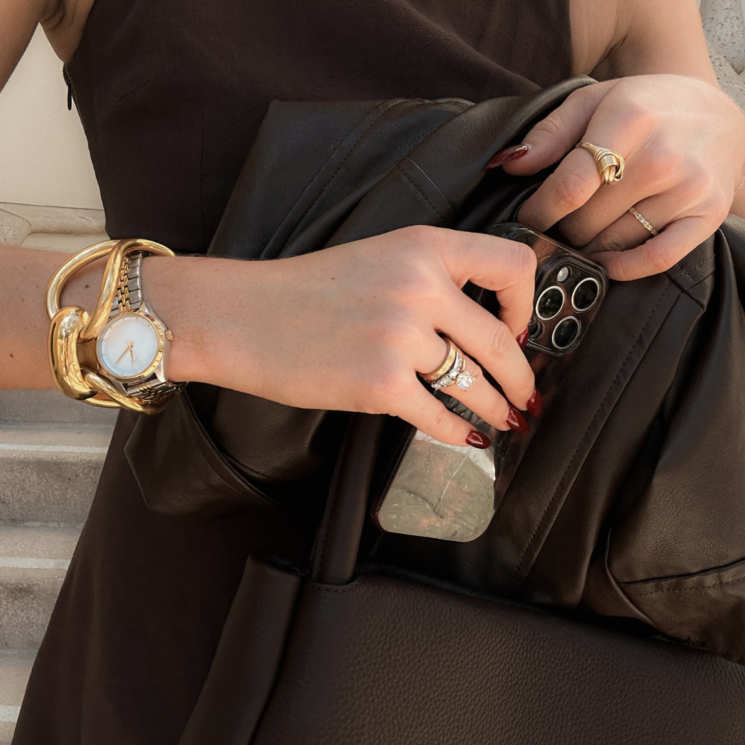
Your brand’s first impression doesn’t begin with what you say — it begins with how you look.
Before someone reads your services page, browses your offers, or even follows you on social media, they’re already making instant judgments based on your visual identity. That’s why the design of your brand matters. Not just because it’s beautiful or trendy, but because it communicates your clarity, professionalism, and positioning at first glance.
At The Agency, we believe no design element should be accidental. Every detail, from your logo and color palette to the typography you use and the imagery you choose, should work together intentionally to tell your story and reinforce your goals. That’s why we created this foolproof styling guide — a walkthrough of the foundational elements behind strategic, elevated design, so you can show up with clarity, confidence, and purpose.
Start With Brand Foundations
Before you touch design, you need to ground yourself in the bigger picture: who you are, what you offer, who you serve, and what sets you apart. These foundations become the lens through which every creative decision is made. Without that clarity, even the most polished visuals can feel disconnected. When you know your mission, understand your audience, and can clearly articulate your brand positioning, you give yourself a reliable guide for evaluating colors, fonts, layouts, and imagery.
Choose a Cohesive Color Palette
Color has the power to communicate emotion, tone, and energy before a word is ever read. That’s why a strong brand color palette is essential. Instead of throwing together random favorites, you want to build a cohesive system that balances signature tones, accent colors, and neutrals in a way that reflects how you want your audience to feel. Whether you’re aiming for soft and calming, bold and dynamic, or refined and luxurious, your color choices should be intentional and consistent — helping create instant visual recognition and emotional connection.
Define Your Brand Typography
Your typography carries just as much personality as your visuals. A sleek sans-serif gives off a completely different impression than a delicate script or a bold serif. To maintain cohesion, stick to two or three complementary typefaces: one for headlines, one for body text, and possibly an accent font for special uses. Prioritize readability while making sure your typography reflects your overall brand mood — because if your audience can’t easily read or engage with your text, even the most stylish design will fall short.
Create a Signature Visual Style
Beyond fonts and colors, your visual style is what makes your brand feel uniquely yours. This includes your photography tone, graphic style, iconography, and even the textures you incorporate. Do you want your visuals to feel light and airy, or rich and dramatic? Should your graphics lean toward minimalism or embrace more expressive detail? Once you decide on the tone, consistency is key. A signature style creates familiarity over time, helping your audience recognize you at a glance across platforms.
Ensure Design Consistency Across Channels
A polished brand identity isn’t limited to your website. It should extend across every touchpoint — social media, email marketing, print materials, packaging, and beyond. When your brand shows up consistently, you build trust and recognition. This means using your established colors, fonts, and visuals everywhere you communicate, making sure no piece feels out of place or off-brand. Strong, cohesive design is one of the simplest ways to reinforce the legitimacy and professionalism of your business.
Prioritize User Experience
Elevated design is never just about aesthetics. It’s about guiding your audience smoothly and intentionally toward action. Good design creates clarity, not confusion. That means your website should be easy to navigate, your calls-to-action should be clearly visible, and your content should flow logically. When your audience knows where to go and what to do, they’re more likely to engage, inquire, or convert — and that’s when your brand presence starts working for you.
Invest in Professional Assets
While stock photos and DIY graphics can work in the short term, nothing replaces the power of professional photography and custom visuals that are aligned perfectly with your brand. Investing in high-quality images, custom graphics, or thoughtful illustrations elevates the look and feel of your brand, communicates credibility, and helps you stand out in a crowded space. These extra layers of intention make a noticeable difference and reinforce the perception that your brand is worth paying attention to.
Evolve Intentionally
Your brand is not fixed. As you grow and evolve, your visual identity may shift — and that’s not only normal, it’s healthy. But change should happen with intention. Periodically reassess what’s aligned, what feels outdated, and what your audience needs from you now. Thoughtful, strategic evolution allows your brand to mature without losing its essence or confusing your audience. It’s about refinement, not reinvention.
Final Thoughts
Your visual identity is the first — and often most powerful — way you communicate your brand’s value. With the right design foundation, you can show up confidently, knowing that your visuals reflect your expertise, your positioning, and your purpose.
At The Agency, we help brands craft intentional, strategic identities that go beyond the surface. We design websites, brands, and marketing systems that connect, convert, and create long-term growth.
If you’re ready to elevate your brand presence with clarity and confidence, we’d love to help.
Learn more at https://marketingwiththeagency.com


 and your core offerings like web design, branding, and SEO for service-based businesses: --- ### 🔹 **Left Image (Explore Our Services)** * **SEO-Focused Image Title:** Website Strategy Planning for Service-Based Businesses * **SEO-Focused Alt Text:** Woman reviewing website design plans and strategy for branding in a cozy workspace with coffee 📈 **Why it’s better:** Includes keywords like `website design`, `strategy`, `branding`, and `service-based businesses` — all highly relevant to your niche. --- ### 🔹 **Right Image (The Portfolio)** * **SEO-Focused Image Title:** Creative Branding and Web Design Workspace Setup * **SEO-Focused Alt Text:** Branding expert working on client projects at a modern glass desk with coffee, laptop, and sunglasses in a bright office 📈 **Why it’s better:** Integrates terms like `branding expert`, `web design`, and `client projects`, which help Google understand the context of your work and improve image visibility in search results. ---")

Comments +