
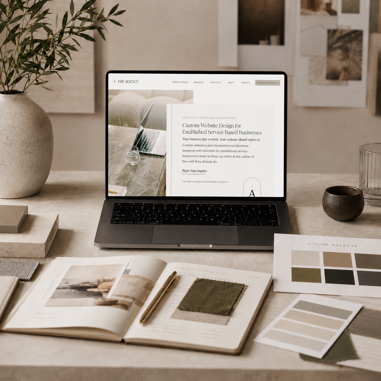

Color is one of the fastest ways people form an impression of your brand.
Before they read your copy, understand your process, compare your services, or decide whether to reach out, they are already responding to the way your website feels. The colors, contrast, spacing, imagery, and overall visual direction are quietly telling them what kind of business they have landed on.
That matters because your website is not only there to look beautiful.
It is there to create trust.
The right website color palette can make your brand feel more refined, more credible, more established, and more aligned with the level of work you actually provide. The wrong palette can make even a strong business feel generic, dated, inconsistent, or less elevated than it really is.
A luxury website color palette is not about using beige, black, gold, or muted neutrals because they look expensive. It is about choosing colors with intention so your brand feels clear, cohesive, and aligned with the client experience you want to create.
Elevated Color Starts With Brand Positioning
Before choosing colors, you have to understand what your brand needs to communicate.
A website color palette should not begin with “What colors do I like?” It should begin with better questions.
What do you want people to feel when they land on your website? Should the brand feel calm, refined, bold, editorial, warm, modern, grounded, feminine, polished, creative, trustworthy, or high-touch? What level of investment are you asking people to make? What kind of clients do you want to attract? What kind of perception does your website need to support?
The most elevated color palettes are built around positioning.
A wellness brand may need colors that feel calming, restorative, and soft without becoming too pale or passive. A construction company may need a palette that feels strong, grounded, and trustworthy without looking heavy or outdated. A speaker or personal brand may need colors that feel polished, memorable, and authoritative without overpowering the message.
Color has a job.
It should support the way you want your business to be perceived.
Luxury Does Not Always Mean Neutral
Neutral palettes are popular in elevated website design, and for good reason. Cream, ivory, warm white, taupe, soft gray, charcoal, sand, and muted browns can create a refined foundation that feels timeless and easy to trust.
But luxury does not always mean neutral.
A brand can feel elevated with deep green, oxblood, navy, dusty blue, muted plum, warm terracotta, olive, espresso, soft blush, or even a carefully placed brighter accent. The difference is not whether the palette is colorful. The difference is whether the color is controlled, intentional, and supported by the rest of the brand identity.
A color palette starts to feel less elevated when too many colors are competing, the tones feel disconnected, or the accent color is used everywhere without restraint.
The most sophisticated websites usually have a clear hierarchy. There is a primary foundation, a supporting neutral system, a deeper contrast color, and one or two accents used with purpose.
That restraint is what makes the palette feel custom instead of chaotic.
Your Website Needs More Than One Pretty Color
A strong website color palette is not a single color you love.
It is a system.
Your website needs colors for backgrounds, headings, body text, buttons, links, hover states, borders, forms, section breaks, icons, calls to action, image overlays, and subtle design details. If the palette is not built with the full website experience in mind, the design can quickly become inconsistent.
A refined website palette usually includes a light base color, a strong text color, a secondary background color, a contrast color, and an accent color.
The light base keeps the website open and breathable. The strong text color makes the site readable and grounded. The secondary background adds depth and variation. The contrast color creates strength and structure. The accent color draws attention to the most important actions.
This is where strategy matters.
If every color is treated as decorative, the website may look pretty but fail to guide the visitor. If color is used intentionally, it helps create movement through the site.
The right palette does not only make the website more beautiful.
It makes the website easier to navigate, understand, and act on.
Contrast Is What Makes a Website Feel Professional
One of the biggest mistakes in soft, elevated website design is not having enough contrast.
A palette may look beautiful on a mood board, but once it is used on a website, the text feels too faint, buttons disappear, and important sections lose impact. When everything is soft, nothing stands out.
Elevated does not mean washed out.
A luxury website still needs clarity.
Your body copy needs to be easy to read. Your calls to action need to be visible. Your service sections need to have enough structure. Your forms need to feel usable. Your navigation needs to be clear on desktop and mobile.
This is why a deeper color is often essential. A charcoal, espresso, deep olive, warm black, navy, or rich brown can give the palette authority and structure. It keeps the brand from feeling too delicate and helps the website feel more expensive, polished, and functional.
A refined palette balances softness with strength.
That balance is what creates a website that feels both beautiful and usable.
The Best Color Palettes Feel Cohesive With Your Photography
Your website colors do not exist alone.
They sit beside your photography, typography, logo, copy, icons, and layout. If your colors and imagery are not aligned, the entire website can feel disconnected even if each individual piece is beautiful.
For example, if your brand palette is cool, soft, and muted, but your photography is warm, saturated, and high-contrast, the website may feel inconsistent. If your palette is refined and minimal, but your images are busy, bright, and casual, the brand may lose the elevated feeling you are trying to create.
The best website color palettes are chosen with photography in mind.
They should complement the tones in your images, support the mood of your visuals, and create a consistent brand atmosphere from page to page.
This is especially important for service-based businesses, where the feeling of the website often becomes part of the client’s first impression of the experience itself.
Your colors should make the entire brand feel connected.
Accent Colors Should Be Used With Restraint
Accent colors are powerful because they guide attention.
They tell the visitor where to look, what matters, and what action to take next. But when an accent color is used too often, it loses that power.
A common website mistake is choosing a beautiful accent color and then applying it everywhere: buttons, headings, icons, backgrounds, lines, links, graphics, and decorative details. The result may feel busy instead of elevated.
A stronger approach is to use the accent color intentionally.
Let it highlight calls to action, important links, small brand moments, or key visual details. Give it space to matter.
In elevated website design, restraint creates impact.
The fewer places an accent appears, the more attention it receives when it does.
Your Colors Should Support Conversion
A website color palette should not only be chosen for aesthetics.
It should support conversion.
The visitor should be able to move through your website easily. They should know where to look, which sections matter, and what step to take next. Color helps create that path.
Buttons should be clear. Calls to action should feel intentional. Important sections should have enough contrast. Forms should be easy to complete. The overall palette should create trust without distracting from the message.
This is where many beautiful websites fall short.
They look elevated, but they do not guide action.
At The Agency, we believe the best websites sit at the intersection of beauty and strategy. The design should feel refined, but it should also help the right people understand your value and take the next step with confidence.
That means color has to do more than look good.
It has to work.
Trendy Colors Can Date Your Website Quickly
Trends can be useful for inspiration, but they should not be the entire foundation of your brand.
A color palette that feels current today can feel overused or dated quickly if it is too closely tied to a trend. This is especially true for brands that want to feel established, high-end, or timeless.
That does not mean your website should feel boring.
It means your palette should be built around your brand, not just what is popular online.
A timeless palette can still feel modern. It can still feel distinct. It can still feel fresh. The difference is that the colors are chosen because they support the business, not because they are everywhere this season.
A strong brand identity should have enough longevity to grow with you.
A More Elevated Website Starts With Better Brand Decisions
If your website feels flat, generic, or not quite aligned, the color palette may be part of the issue.
But color is rarely the only issue.
A truly elevated website comes from the full brand system working together: positioning, copy, color, typography, photography, layout, spacing, calls to action, and the client journey.
Color is one of the most visible pieces, but it works best when it is connected to a larger strategy.
That is why choosing website colors should not feel like guessing. It should feel like translating the quality of your business into a visual language people can understand quickly.
When the palette is right, the website feels more refined. The brand feels more trustworthy. The message feels clearer. The entire experience feels more intentional.
And when the website feels more intentional, the business behind it feels more valuable.
Build a Website Color Palette That Reflects the Level of Your Brand
Your website colors should not simply decorate your brand.
They should help define it.
They should make your business feel aligned with the level of clients, opportunities, and growth you are trying to attract. They should support the way people experience your value before they ever inquire.
At The Agency, we create custom websites and elevated brand identities for businesses that are ready for a more refined, strategic online presence. Every color, font, page layout, and design decision is chosen with intention — so your website does more than look beautiful. It supports how your brand is seen, trusted, and chosen.
If your current website no longer feels like the caliber of your business, this may be the place to begin.
View our portfolio, then begin your inquiry.
Let’s build a website and brand identity that feel as elevated as the business behind them.





Comments +