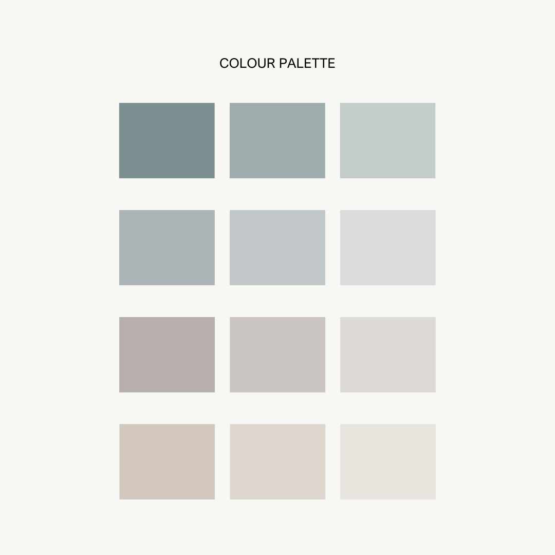
Let’s dive into something that’s incredibly powerful yet often underestimated in web design — the subtle, persuasive pull of color psychology. We’re not just splashing paint on a canvas here; we’re strategically choosing colors that resonate with your audience’s deepest needs and desires, especially in the wellness sector.
Understanding the Silent Language of Color
First off, grasp this: Color is a silent language. It speaks volumes without saying a word, influencing emotions and decisions, especially in an industry that’s all about balance, health, and tranquility. The right color scheme can transform your website from just another page to a soothing sanctuary that mirrors the peace your clients seek.
Your Wellness Color Palette
Now, let’s break down the MVPs of your color strategy:
- Blues: Trust, serenity, and calm — blues are your go-to for creating a sense of trust and safety. Perfect for headers, footers, or any place where you want to evoke stability and trust.
- Greens: The color of balance, renewal, and health. It’s a natural fit for wellness websites, symbolizing growth and harmony. Use it where you want to inspire action or evoke a sense of calm.
- Lavender and Lilac: Gentle and soothing, these shades are great for areas of your site dedicated to mindfulness and relaxation. They’re your allies in creating a serene and inviting space.
- Soft Whites and Creams: Clarity, purity, and simplicity — these colors provide a clean and minimalist backdrop that enhances content readability while keeping the vibe light and airy.
- Earthy Tones: Bringing a sense of warmth and grounding, earthy tones like beige, terracotta, and soft browns can make your website feel welcoming and rooted.
Strategically Implementing Your Color Choices
When crafting your site, think of it as curating an experience:
- CTAs (Calls to Action): Go for contrasts with your background, but avoid jarring colors. Soft greens or blues can be inviting without being pushy.
- Testimonials: Soft blues or warm neutrals here can foster a sense of authenticity and trust, encouraging new visitors to take that leap of faith.
- Content: Keep it readable and calming. Dark gray text on a light background can be softer on the eyes than stark black and white, offering a more relaxed reading experience.
Bringing It All Together
In the wellness space, your website should be a digital extension of the peace and healing your brand represents. By leveraging the nuances of color psychology, you’re not just designing; you’re communicating. You’re telling a story that resonates with your visitors’ quest for balance and well-being.
Ready to transform your website into a tranquil haven that beckons your ideal clients? Remember, it’s all about creating an environment where they feel understood, supported, and ready to embark on their wellness journey with you.
With the right colors, you’re not just catching eyes; you’re nurturing hearts and inviting transformation. Color can make your site a place where visitors naturally feel at ease and in tune with your message.
Ready to turn your wellness website into a calming, inviting space that reflects your brand’s essence? The Agency is here to help. We specialize in creating bespoke web designs that resonate with your audience and elevate your online presence. Contact us today to start your journey towards a more tranquil, engaging website. Let’s bring the color of calm to your digital doorstep.


Comments +